npm init slidev@latestTechnical presentations with Slidev
I recently started using Slidev for creating presentations. It is a tool to create a Powerpoint/Keynote/Google Slides like presentation, but using Markdown instead. In this blog post, I will explain the basics and share some of my favorite tips and tricks.
Getting started
To get started, you need to have Node installed on your system. After that, you can create a new presentation like this:
Run npm install to install all dependencies.
Finally, run npm run dev to start a live reload server that shows the presentation in your browser.
By editing slides.md, you change the presentation.
Now that we have our project set up, let’s explore the different ways we can structure our slides using Slidev’s built-in layouts.
Built-in Layouts
The simplest presentation that you can have is something like this:
---
theme: default
---

# Welcome to Slidev

---

# This is the second slide

* You can add some bullet points
* Here is another one
It will generate a presentation with a title slide that shows "Welcome to Slidev" and a second slide with a title and some bullet points.
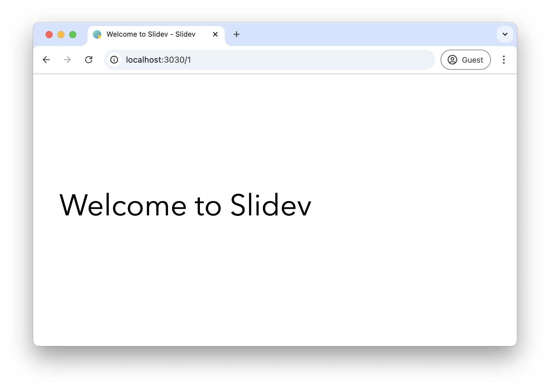
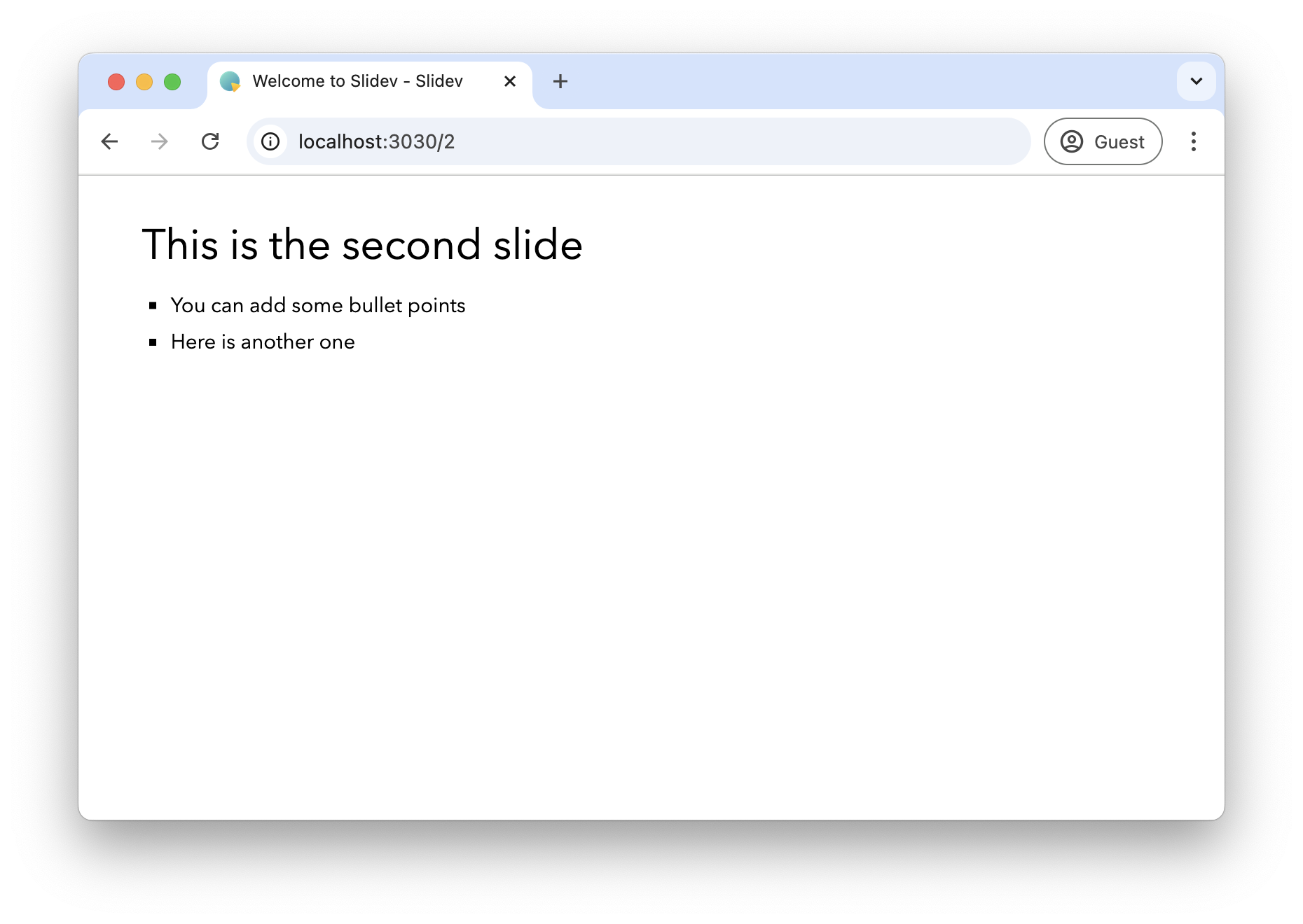
Each slide is separated by 3 dashes (---) in the markdown file.
The layout of the first slide is cover and the rest are default. You can choose the layout per slide by selecting one of the built-in layouts and apply it with the layout option in the frontmatter:
---
layout: image-right
image: images/tools.jpg
---

# This is a slide with an image on the right

* Bullet points will be properly wrapped on the left side of the slide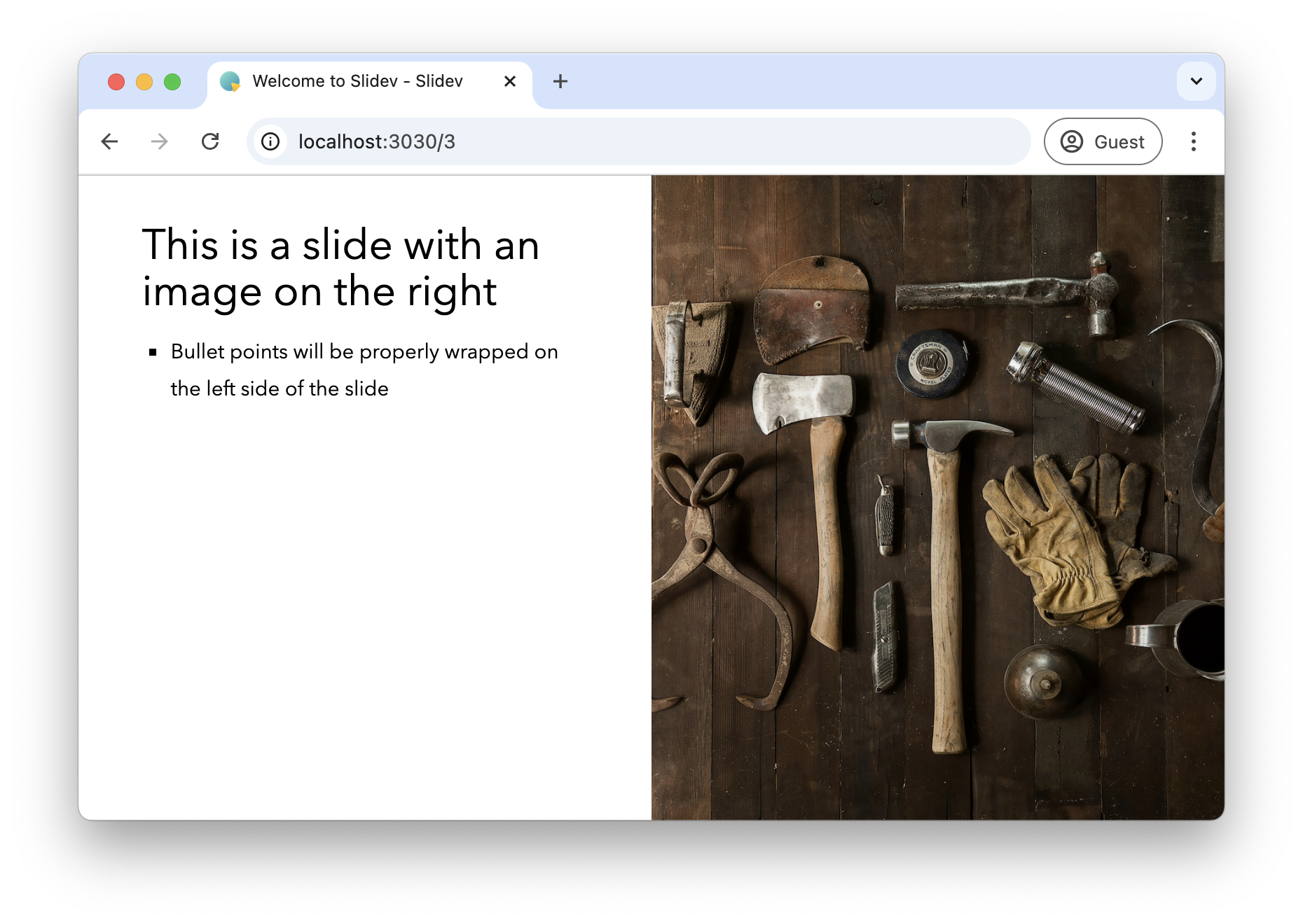
The build-in layouts already go a long way, but you are not restricted to those. Some themes will add additional layouts that you can use. As an example, the Penguin theme has a two-thirds layout option that allows to have a 2/3 and 1/3 split on the slide. And if you want something custom, you can create your own layout inside your presentation project as well.
While layouts determine the overall structure of your slides, you’ll often want to fine-tune the appearance of individual elements. This is where Slidev’s styling capabilities come into play.
Styling
The HTML is styled via UnoCSS which is an Atomic CSS framework similar to Tailwind CSS. You can write HTML inside the markdown and use the UnoCSS classes to style that HTML.
For example:
---

# Styling with UnoCSS

<div class="grid grid-cols-2">
    <div class="text-green-600 text-2xl">Left</div>
    <div class="text-red-400 text-2xl">Right</div>
</div>

---
This renders to:

Icons
To enable icon support, you need to install the UnoCSS icon preset and then also the icon pack of your choice.
npm install -D @unocss/preset-icons @iconify-json/solar @iconify-json/deviconYou can search for icons via https://icones.js.org/collection/all.
To add an icon to your slide, you can either use a CSS class or use them directly as components.
Let’s, for example, render the bag-music-outline icon from the Solar set:
---

# Icons

## As CSS class

<div class="flex items-center gap-4 mb-8">
    <div class="i-solar-bag-music-outline" ></div>
    <div class="i-solar-bag-music-outline text-4xl" ></div>
</div>

## As component

<div class="flex items-center gap-4">
    <solar-bag-music-outline />
    <solar-bag-music-outline class="text-red-600 text-4xl" />
</div>

---
This creates a slide like this:
The built-in features we’ve covered so far are powerful, but sometimes you need something more specific to your needs. Let’s look at how custom layouts can provide this customization.
Custom layouts
With this basic knowledge, we can create a custom layout. To create a custom layout, you create a Vue component in the layouts directory.
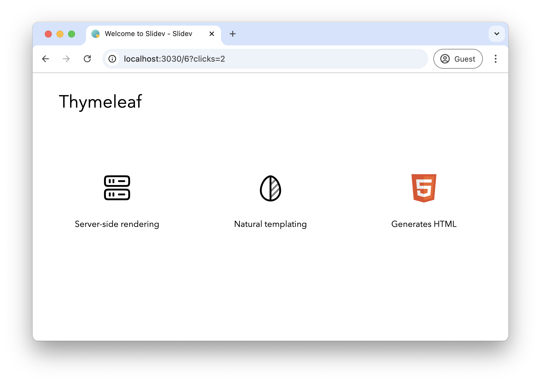
As an example, we will create a layout that shows a slide title and 3 icons with text below each icon. Start by creating layouts/three-icons.vue:
<template>
  <div class="slidev-layout">
    <slot name="default"></slot>
    <div class='grid grid-cols-3 grid-rows-1 gap-20 mt-32'>
      <div class="flex flex-col justify-center items-center gap-4">
        <div class="text-6xl" :class="$attrs.firstIcon"/>
        <slot name="first"></slot>
      </div>
      <div v-click class="flex flex-col justify-center items-center gap-4">
        <div class="text-6xl" :class="$attrs.secondIcon"/>
        <slot name="second"></slot>
      </div>
      <div v-click class="flex flex-col justify-center items-center gap-4">
        <div class="text-6xl" :class="$attrs.thirdIcon"/>
        <slot name="third"></slot>
      </div>
    </div>
  </div>
</template>
The layout uses 4 slots: default, first, second and third.
The default slot is used to place the slide title.
The other slots represent the places where the icons and text will be placed. There are also the firstIcon, secondIcon and thirdIcon attributes that need to be set so the layout knows what components to render.
There is also the v-click attribute on the second and third div so that only the first icon is visible initially. Advance the presentation to reveal the other icons. If you want everything visible at once, just remove the v-click attribute in the custom layout.
We can use our custom layout to render something like this:
---
layout: three-icons
firstIcon: i-solar-server-2-linear
secondIcon: i-solar-leaf-line-duotone
thirdIcon: i-devicon-html5
---

# Thymeleaf

::first::

Server-side rendering

::second::

Natural templating

::third::

Generates HTML
Result:
Code
A lot of technical presentations will show code on the screen. Slidev makes this trivial by using Markdown code blocks.
---

# Some code blocks

* Java
```java
public record User(String name, LocalDate birthday) {
}
```

* HTML
```html
<div class="flex gap-4">
  <div>Syntax highlighting is built-in</div>
</div>
```

* JavaScript
```javascript
export function sayHello() {
  console.log('Hello')
}
```
---
Rendered, this looks like this:
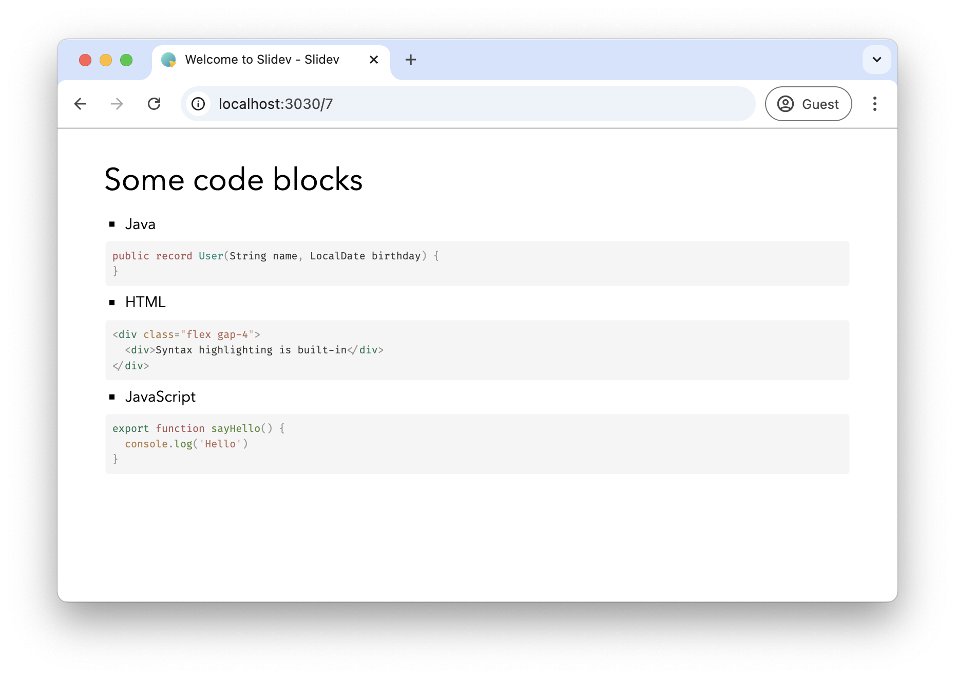
One neat trick I have found convenient is when you have some bullet items with each item having a small code block associated.
Suppose now you want to bring in the bullet item with the associated code block one by one.
For that case, you can use <v-clicks every="2"> like this:
---

# Some code blocks

<v-clicks every="2">

* Java
```java
public record User(String name, LocalDate birthday) {
}
```

* HTML
```html
<div class="flex gap-4">
  <div>Syntax highlighting is built-in</div>
</div>
```

* JavaScript
```javascript
export function sayHello() {
  console.log('Hello')
}
```
</v-clicks>
---
If you cycle through the presentation, it will show each code block with the bulleted item in turn.
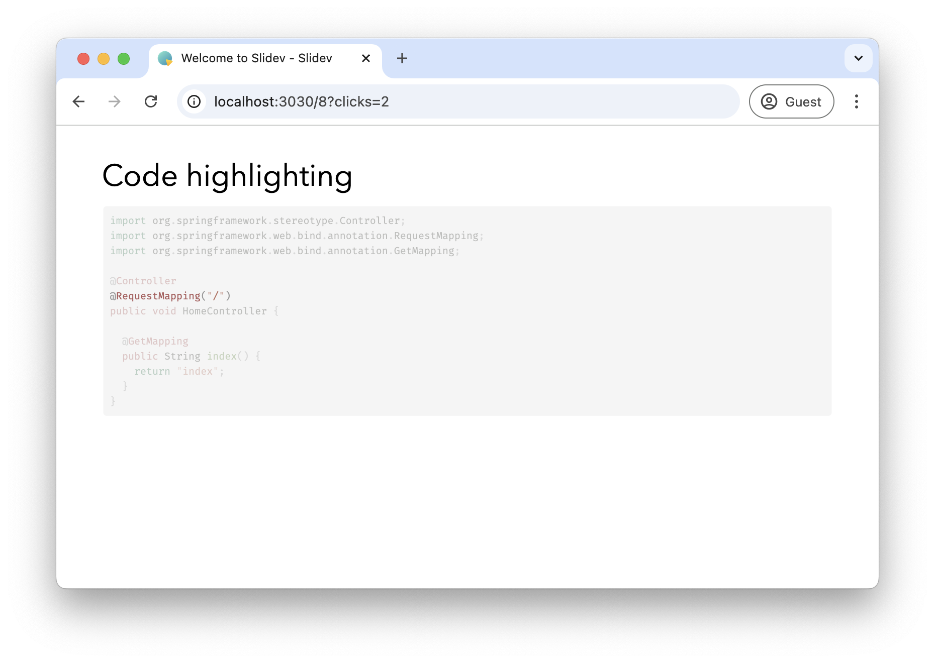
Another Slidev feature is highlighting of lines. This is especially useful to explain slightly longer code blocks.
---

# Code highlighting

```java {7,13|5|6|9-12|*}
import org.springframework.stereotype.Controller;
import org.springframework.web.bind.annotation.RequestMapping;
import org.springframework.web.bind.annotation.GetMapping;

@Controller
@RequestMapping("/")
public void HomeController {

  @GetMapping
  public String index() {
    return "index";
  }
}
```

---
Note the sequence {7,13|5|6|9-12|*} after the language selection in the code block.
This will instruct the highlighter to:
-
First highlight lines 7 and 13
-
Highlight line 5
-
Highlight line 6
-
Highlight lines 9 to 12
-
Finally, show the complete code block
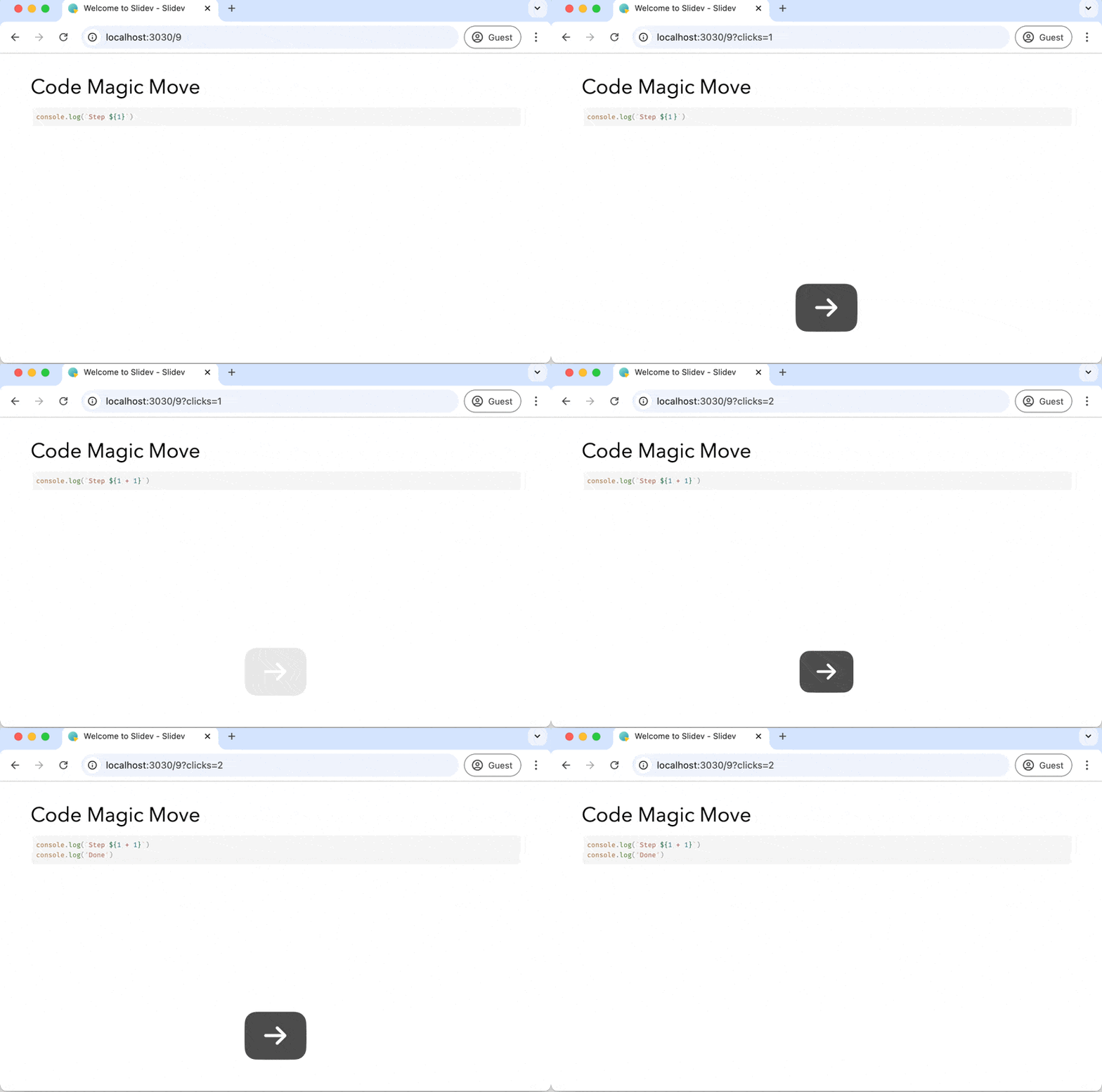
Another very nice thing you can do with code block is Magic Move. It will animate code blocks to bring in or remove lines of code.
A small example:
---

# Code Magic Move

````md magic-move
```js
console.log(`Step ${1}`)
```
```js
console.log(`Step ${1 + 1}`)
```
```ts
console.log(`Step ${1 + 1}`)
console.log('Done')
```
````
---
Note that you need to have 4 backticks with the md magic-move text.
Then, you add a normal Markdown code block for each part that you want to show.
The magic move will do its magic and animate automatically between the code blocks.
Tables
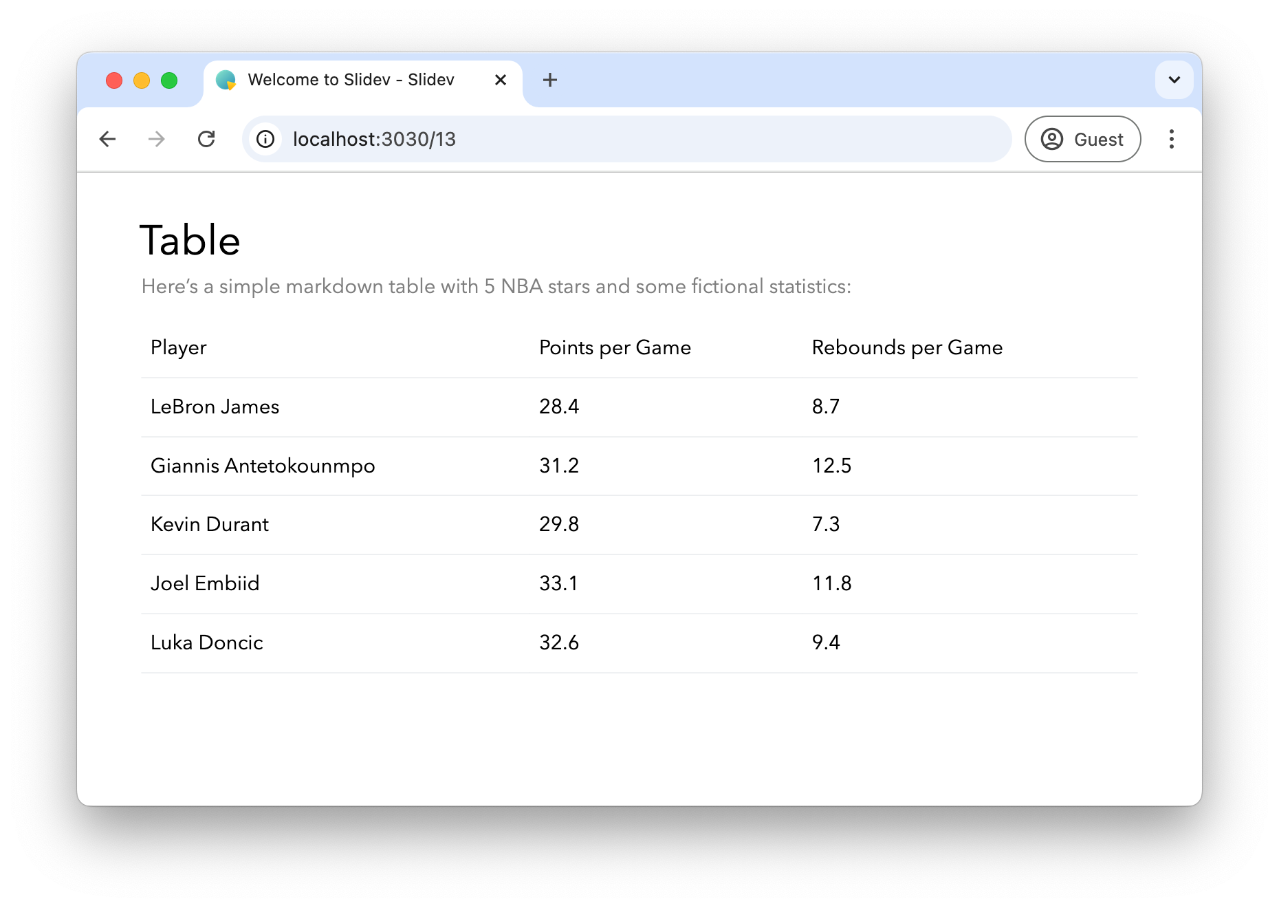
Standard Markdown tables are rendered nicely:
---

# Table

Here's a simple markdown table with 5 NBA stars and some fictional statistics:

| Player                | Points per Game | Rebounds per Game |
|-----------------------|-----------------|-------------------|
| LeBron James          | 28.4            | 8.7               |
| Giannis Antetokounmpo | 31.2            | 12.5              |
| Kevin Durant          | 29.8            | 7.3               |
| Joel Embiid           | 33.1            | 11.8              |
| Luka Doncic           | 32.6            | 9.4               |

---
You can also combine tables with icons like this:
# Features

| Feature            | Slidev                                                                         | PowerPoint                                                                                          |
|--------------------|--------------------------------------------------------------------------------|-----------------------------------------------------------------------------------------------------|
| Developer-Friendly | <solar-clipboard-check-linear class="text-green-700" /> Markdown               | <solar-clipboard-remove-linear class="text-red-700"/>                                               |
| Version Control    | <solar-clipboard-check-linear class="text-green-700" /> Git-friendly           | <solar-clipboard-remove-linear class="text-red-700"/> Binary files                                  |
| Animations         | <solar-shield-warning-linear class="text-orange-700"/> CSS animations          | <solar-clipboard-check-linear class="text-green-700" /> Rich animation library                      |
| Customization      | <solar-clipboard-check-linear class="text-green-700" /> CSS and Vue components | <solar-shield-warning-linear class="text-orange-700"/> Built-in themes                              |
Diagrams
Slidev supports PlantUML and Mermaid diagrams. This is an example of a PlantUML diagram:
---

# PlantUML sequence diagram

<style>
    img {
        height: 80%;
        margin: auto;
    }
</style>

```plantuml
@startuml

@startuml
    Alice -> Bob: Authentication Request
    Bob --> Alice: Authentication Response
    Alice -> Bob: Another authentication Request
    Alice <-- Bob: another authentication Response
@enduml


@enduml

```

---
Note how we use the <style> section to make the diagram a proper size for the slide.
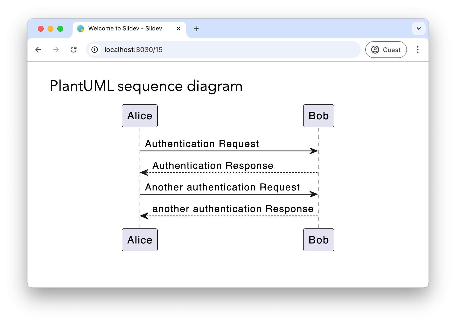
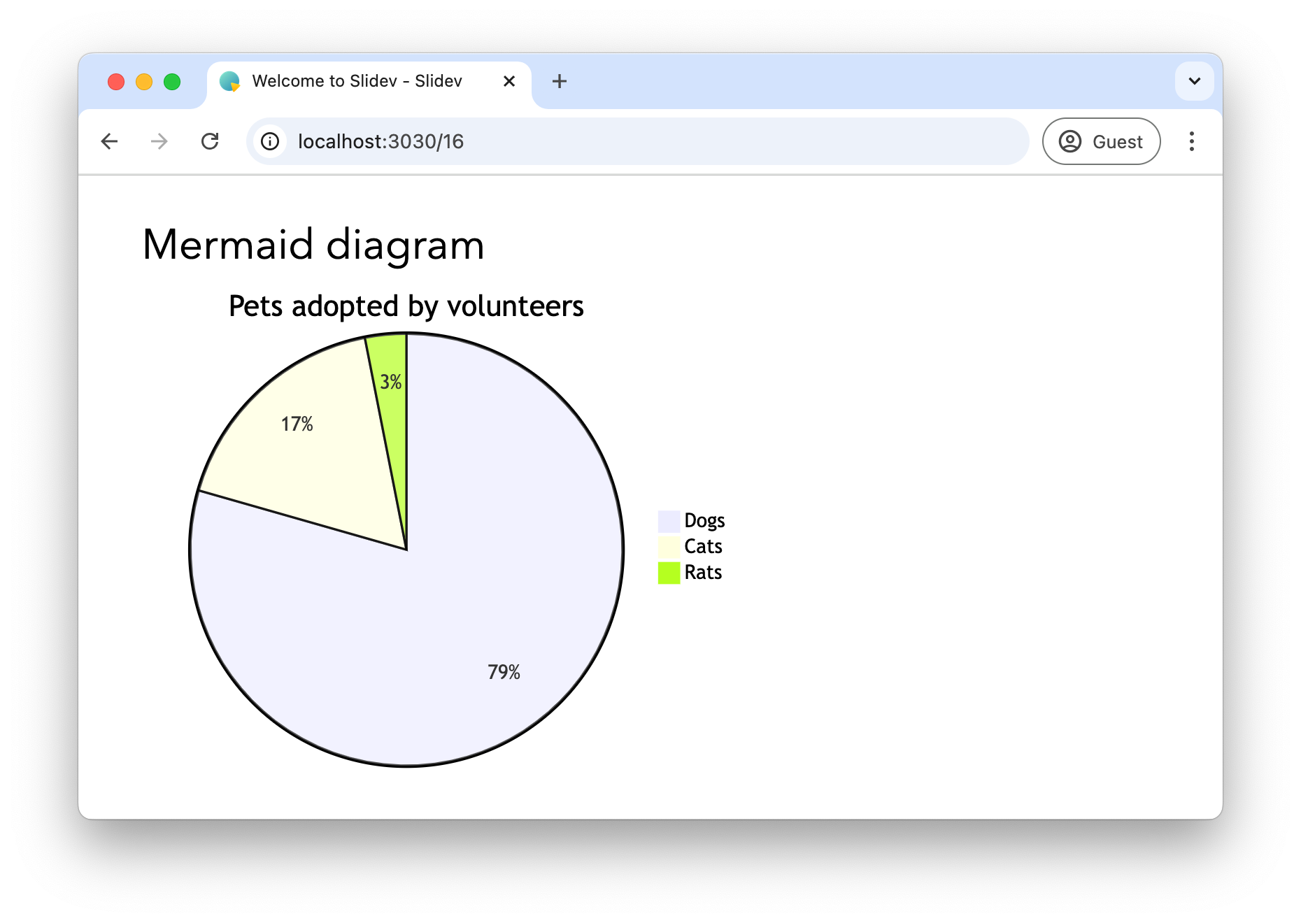
And an example with Mermaid:
---

# Mermaid diagram

```mermaid
pie title Pets adopted by volunteers
    "Dogs" : 386
    "Cats" : 85
    "Rats" : 15
```
Tips and tricks
In this final part of the blog post, I’ll share some nice tips and tricks I found while using the tool.
Underline or highlight words
Slidev has support for Rough notation which allows adding some effects like underline, cirle, or highlight pieces of text.
---

# Rough markers

You can <span v-mark.red>underline</span> or <span v-mark.highlight.yellow>highlight</span> words in the presentation.


---
See Rough Marker for more information. Also check the various types of markers you can use.
Add arrow
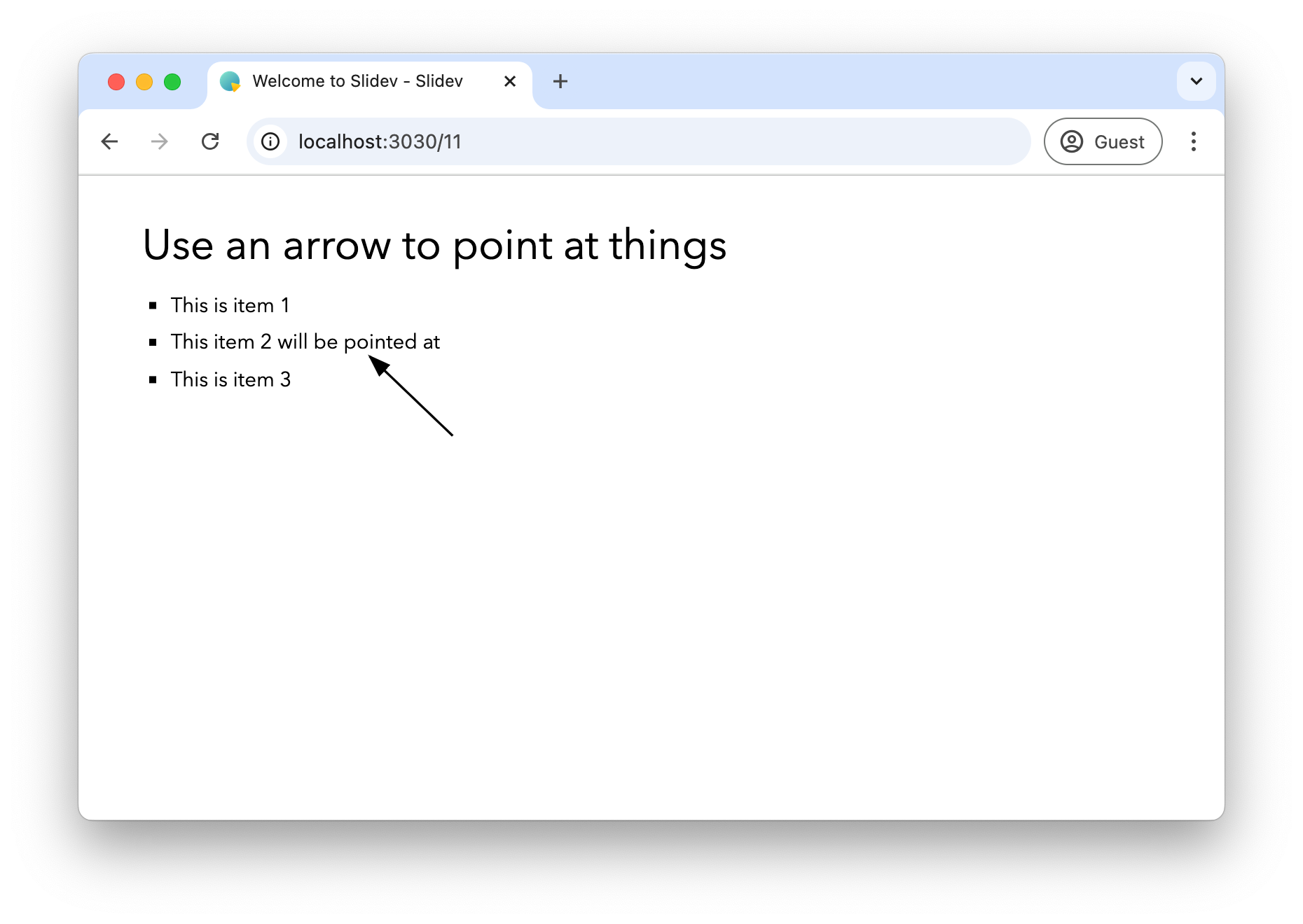
It is a bit tricky to use, but you can use the <Arrow> component to add an arrow to the presentation.
Example:
---

# Use an arrow to point at things

* This is item 1
* This item 2 will be pointed at
* This is item 3

<Arrow x1="320" y1="223" x2="249" y2="155" />

---
You will need to use a bit of trial and error to find the good coordinates for the arrow.
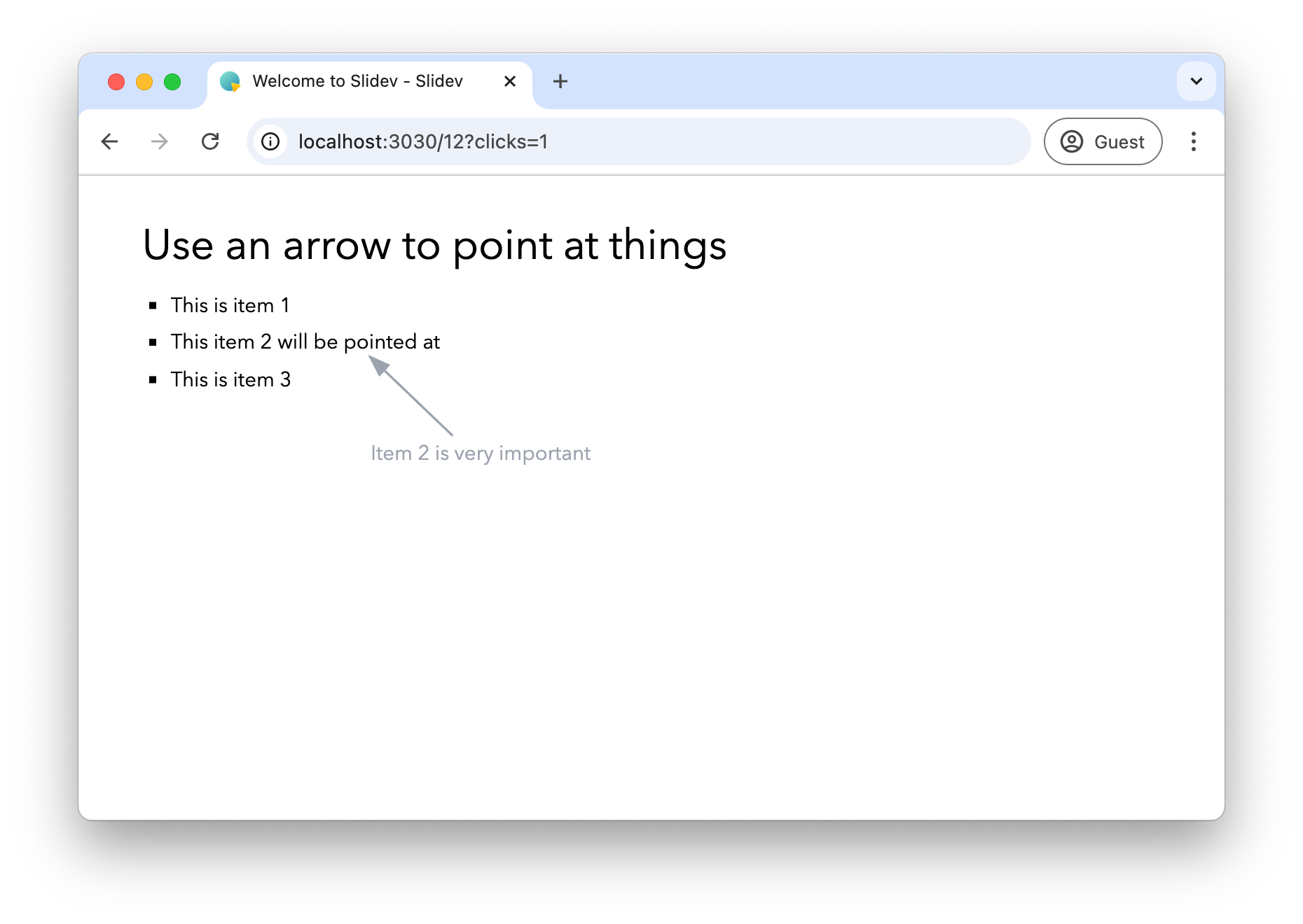
If you want to add text to the arrow, you can absolutely position it.
In this next example, I also used v-click and v-after to have the arrow and text hidden at first, and then appear at the same time.
---

# Use an arrow to point at things

* This is item 1
* This item 2 will be pointed at
* This is item 3

<Arrow v-click x1="320" y1="223" x2="249" y2="155" class="text-gray-400"/>
<div v-after class="absolute top-[225px] left-[250px] text-gray-400">
Item 2 is very important
</div>
---
Custom SVG
If the icons that you can have are not enough, you can also import your custom SVG images.
To do that, place the SVG in the components directory.
By loading it in the <script> tag, we can use it in a v-html Vue attribute:
---

# Custom SVG import

<script setup>
import FireFoxLogo from './components/FirefoxLogo.svg?raw';
</script>

<div v-html="FireFoxLogo"></div>
The raw query parameter ensures the SVG is embedded so it can be further styled if you want.
Footer
For consistent branding across your presentation, you might want to add elements that appear on every slide.
Slidev allows to do this by creating a global-bottom.vue component.
You place this in the root of the project.
As an example, we’ll add my name to each slide, except the title slide or the last slide of the deck:
<template>
  <footer
      v-if="$slidev.nav.currentLayout !== 'cover'
      && $slidev.nav.currentLayout !== 'center'
      && $slidev.nav.currentPage !== $slidev.nav.total"
      class="absolute bottom-0 right-1 p-2"
  >
    <div class="flex items-center text-gray-600" >
      <div>Wim Deblauwe</div>
    </div>
  </footer>
</template>
<script setup lang="ts">
</script>
You can find more information about this at Global Layers.
Embed Tweets
You can embed posts from X (tweets from Twitter):
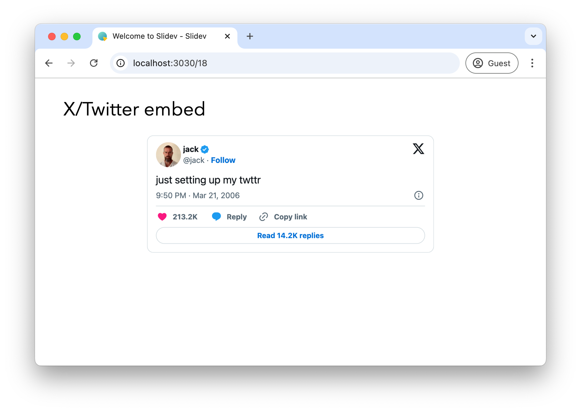
To make it work, you need a bit of setup:
-
Create
style.cssin the root of your project.tweet-container { display: flex; justify-content: center; margin: 20px 0; } -
Create
setup/main.tswith the script code for the embed:import { defineAppSetup } from '@slidev/types' export default defineAppSetup(({ app, router }) => { // Load Twitter widgets script when the app is mounted router.afterEach(() => { const script = document.createElement('script') script.src = 'https://platform.twitter.com/widgets.js' script.async = true document.head.appendChild(script) }) }) -
Find the tweet you want to embed and copy the url of it.
-
Use https://publish.twitter.com/ to generate the embed HTML code.
-
Paste the code into the slide, wrapped in a
<div>that sets thetweet-containerclass. Also remove the<script>part that will be in that code block.--- # X/Twitter embed <div class="tweet-container"> <blockquote class="twitter-tweet"><p lang="en" dir="ltr">just setting up my twttr</p>— jack (@jack) <a href="https://twitter.com/jack/status/20?ref_src=twsrc%5Etfw">March 21, 2006</a></blockquote> </div> ---
If it does not work immediately, restart the Slidev presentation by running npm run dev again.
Conclusion
Slidev offers a powerful alternative to traditional presentation tools, particularly appealing to developers who:
-
Prefer working with code over GUI tools
-
Want version control for their presentations
-
Need to showcase code with syntax highlighting
-
Value customization and extensibility
While it has a steeper learning curve than traditional presentation software, the benefits of using Markdown, having Git-friendly presentations, and the ability to create custom layouts makes it an excellent choice for technical presentations.
See slidev-example on GitHub for the full sources of this example.
If you have any questions or remarks, feel free to post a comment at GitHub discussions.
